Click in the Search Bar and start typing your search item.
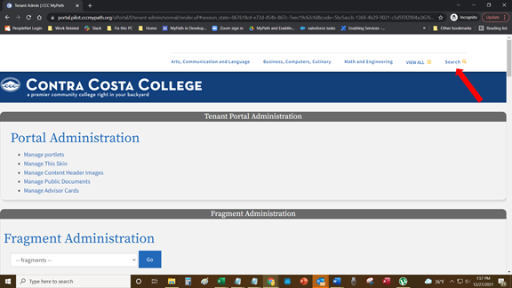
Select one of the displayed search suggestions to retrieve that search item.
Version 2.1.2 - Last update: January 21, 2022
This user guide is intended for authorized CCC college and district staff users of the CCC MyPath student onboarding portal. |
This College Portal MyPath Administration guide is intended for college administrators who want to:
Configure your college's theme (logo, name, background image and colors)
Configure your college's portal communication and messaging
The Tenant Admin tab (as shown below) is the landing page for the college portal administrator following login.
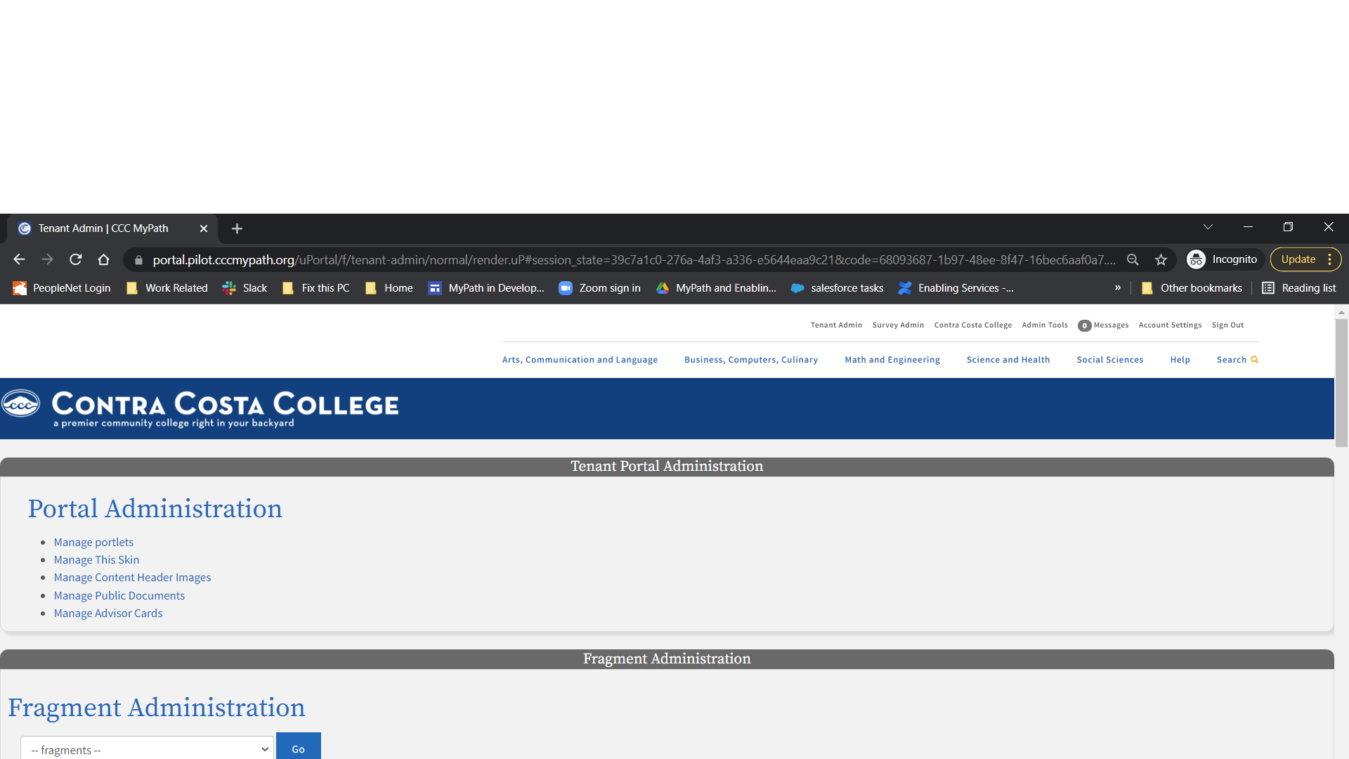
Behind the scenes, the CCC portal serves as the large container for each college's portal. Within each college portal the college administrator configures the look and feel and content on the Tenant Admin tab. Each of the panels in the Tenant Admin tab represent configuration "services" that are available to all colleges for this purpose.
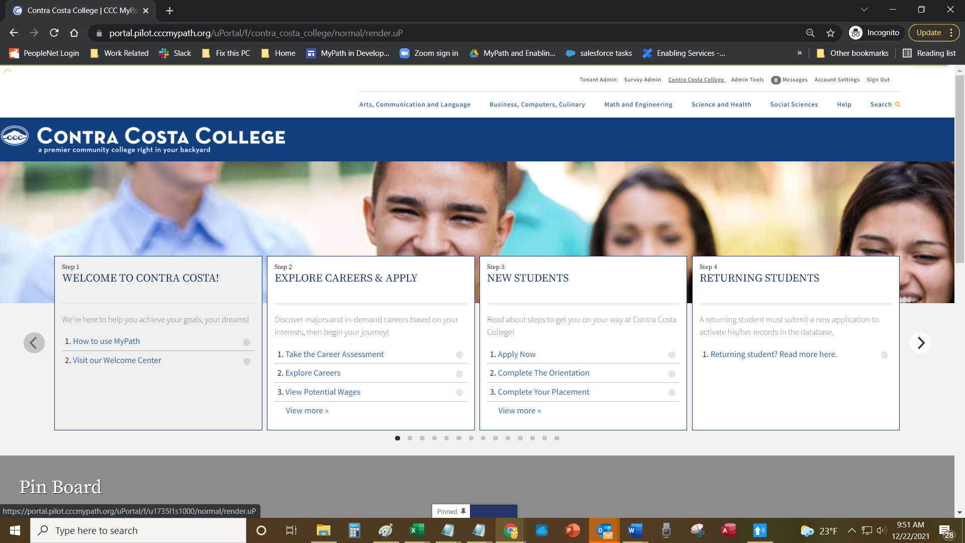
The college portal's end user, currently only students, sees a different view of the college's portal when they log in. The image below is an example of the college students' portal view.
In order to implement the CCC MyPath college portal, your college or district must have an Identity Provider (IdP) set up. One ore more designated college staff users will be provisioned as Tenant Admin users and will authenticate into the portal through your college/district IdP. Tenant Admin users are configured during the implementation process. Changes or updates to existing Tenant Admins should contact CCC Support Services at staffsupportccctc@openccc.zendesk.com.
If your college or district does not have an Identity Provider (IdP), please contact the California Community Colleges Technology Center to discuss your options. |
A portal is a web site that acts as a container for consolidating information and/or services from a variety of sources so that they appear as one cohesive site. The portal contains individual and unique college or district portals within it. Each individual college portal contains built-in portlets for managing their portal. This includes the ability to create new portlets that display information or services to the college end- users.
Plainly put, portlets are:
Web applications that accept client requests and respond with information
Designed for uniformity • Displayed to appear as one web page in the context of the portal
Note: The CCC MyPath portal supports custom portlets and/or connected web applications. One may be easier to implement than the other. The CCCTC expects most colleges to begin using the portal with the built-in portlet features first.
Note: The CCC MyPath portal supports custom portlets and/or connected web applications. One may be easier to implement than the other. The CCCTC expects most colleges to begin using the portal with the built-in portlet features first.
An example of portlets includes the advisor cards (Explore Careers, Choose A College, Apply For College, Pay For College) that display within each unique college or district portal, as in the image above. The advisor cards are a built-in feature in the CCC portal that provide student-tailored information via links in each card.
College administrators and students both log in to their college/district portal via single sign on (SSO). Only the college administrator and its students (to whom it gives access via IdP authentication credentials) can access the college/district portal page. The required login credentials and authentication are explained in more detail in Authenticating With College IdP.
Each college/district portal is contained by the larger CCC MyPath portal. Administrative access to each portal is restricted to the college portal administrator for that college. From a software application point of view, the CCC MyPath portal is one application that serves every college/district. In technical terms, each college or district portal is called a "tenant" of the CCC MyPath portal. As such, the larger portal supports what is referred to as "multi-tenancy."
Portal multi-tenancy means the following universal features are available for each individual college or district portal:
A dedicated portion of the CCC MyPath portal
Access to portal data (portlets) and basic functionality (login, searching, etc.)
Portal page configuration (controlling what displays and how it looks)
Portal page user management (i.e. which authenticated users see what)
Software updates to the portal are applied for all college/district portals at once.
Each college/district portal is contained by the larger CCC MyPath portal. Administrative access to each college/district portal is restricted to the college portal administrator for that college. As a college portal administrator, you have access to the following functions:
Administration
Tenant Portal Administration
Manage Portlets
Manage this Skin
Manage Content Header Images
Manage Public Documents
Fragment Administration
Advisor Card Administration
Admin Messaging Log
Survey Administration
Additional portlet access
App Launchers
Content Portlets
Navigation Menu
Your "role" in the Portal is determined by your Identity Service Provider (IdP). Each college /district portal's administrator will define those roles as part of setting up their IdP. When first integrating with the CCC MyPath portal, your college/district will most likely include an IdP role for the college portal administrator and students. Later, your college/district may want to add one or more college staff IdP roles. See Authenticating with College IdP.
The basic portal user experience depends on your role when you log into the college portal. The common portal experience includes searching, navigation, and linking to content. The college administrators customize the look and feel and content of their portal and configure which portlets display to students.
College students log in to a college portal and interact with each of the portlets.
These portal navigation items are the same no matter if you're the college portal admin or a student:
Log into the portal. A header bar displays that includes the CCC MyPath logo next to a search bar.
Enter a search term in the Search bar and click the Search icon retrieve search results. An auto-suggest feature displays common search options beneath the search window as you type. See Searching the Portal for details.
Click the CCC MyPath logo in the upper left corner from anywhere in the portal to return focus to the home screen.
Scroll down the page to see more items.
The portal acts as a "one-stop shop" for college students in terms of a hub for their college information. College students log in to the college's portal to:
Get information they need for college success.
Interact with recommended topics based on specific needs and interests, such a college directory, course catalog, or information on salaries for different graduates of specific programs. These topics may display as:
Static content portlets
App Launcher portlets
Advisor Card portlets
Surveys o Messaging via portal messaging, email or SMS
The college portal administrator is the initial college user of the college portal. The portal administrator configures the look and feel and the content. The college portal administrator logs in and sees the same header bar and search bar as a student user.

However, the college portal administrator also sees:
Clickable tabs above the search bar that lets the administrator navigate through configuration portlets:
Tenant Admin tab o Survey Admin tab
Any number of administration panels when you scroll down the page, used for creating:
Static content portlets
App Launcher portlets
Advisor Card portlets
Note: You can use portlets to link to specific content. Some examples include a link to a third-party web site or application from an App Launcher portlet.
Note: You can use portlets to link to specific content. Some examples include a link to a third-party web site or application from an App Launcher portlet.
The Portal includes a universal Search bar at the top of the screen. Searches include auto-complete functionality so that suggested search options appear beneath the Search bar as you type.
To perform a search:
Click in the Search Bar and start typing your search item.

Select one of the displayed search suggestions to retrieve that search item.
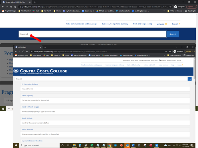
Note: After typing your search term you can press the keyboard's Tab key and then the Return key, or click the Search icon to the right of the search field to display the search results on one page.
Note: After typing your search term you can press the keyboard's Tab key and then the Return key, or click the Search icon to the right of the search field to display the search results on one page.
You can configure your college portal's display by:
Changing the background image and colors.
Branding it with your logo or a custom image.
Branding it with your college’s custom content.
Use one of the anchor links below to go through the steps of configuring your college theme.
Updating the College Header Background/Text Colors and Nav Menu Color
Updating the College Portal Background Image
Editing the College Portal Background Image Transparency Level
Updating the College Logo Image and Content
Use the following steps to configure your college colors and background image.
Navigate to Tenant Admin tab -> Tenant Portal Administration panel -> Manage This Skin link to open the College Skin configuration screen.
If you know the HEX color code, enter it into the Tenant Badge Header Background Color field and proceed to step 6. If you do not know the HEX color code you want to use proceed to step 3.
Click the Tenant Badge Header Background Color field label text, or its associated color box, to open the colors palette.
4. Click and drag the white-triangle slider to display color shades in the larger square box to the left of the slider. | 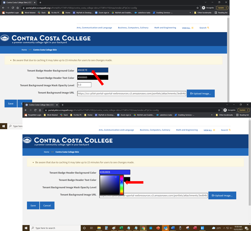 |
5. Once the shade displays that you prefer, click in the square color box to select the color. The exact color selected appears in the Tenant Badge Header Background Color field with the color's hex code in white text. | 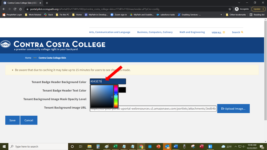 |
6. Click anywhere on the screen outside the color box to close it. 7. Follow steps two and three above to change the Tenant Badge Header Text Color and or the Tenant Nav Menu Color if desired. 8. Click Save to save your changes. Your college portal display now appears with the colors you selected for the background or text. | 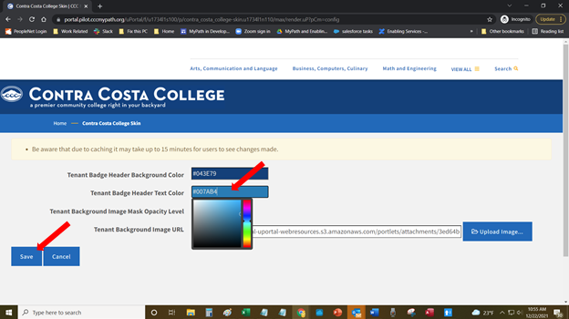 |
Note: Due to caching, it make take up to 15 minutes for changes to header and background colors to be seen by students.
Note: Due to caching, it make take up to 15 minutes for changes to header and background colors to be seen by students.
Navigate to Tenant Admin tab -> Tenant Portal Administration panel -> Manage This Skin link to open the College Skin configuration screen.
To update your college portal's background image, click the Upload Image link next to the Tenant Background Image URL field to open the Attachments dialog box.
Enter the optional file name and source information in the Filename and Source fields, if desired.
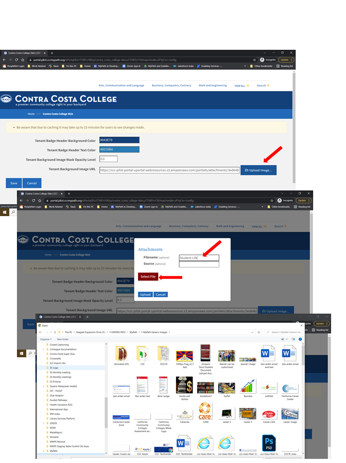
Click Select File to open your operating system's file browser, and navigate to and select the image file you want to use as your college portal's background. The selected file name displays beneath the Select File button (collegeBackground.png in the example image above). Suggested image size is 350px high and a minimum of 1170px wide.
Click Upload to upload the image. The Attachments dialog box closes automatically once the file uploads successfully.
Click Save to save all your changes, close the Manage This Skin screen, and return to the Tenant Admin tab with your new background image displayed.
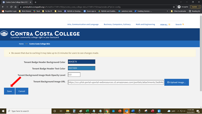
Note: Due to caching, it make take up to 15 minutes for changes to header and background colors to be seen by students.
Note: Due to caching, it make take up to 15 minutes for changes to header and background colors to be seen by students.
Colleges can add a mask to their Background Image and control the transparency level percentage.
Navigate to Tenant Admin tab -> Tenant Portal Administration panel -> Manage This Skin link to open the College Skin configuration screen.
Place the cursor over the Tenant Background Image Mask Opacity Level field and a number picker is displayed.
Click either the up arrow to increase the transparency level or down arrow to decrease it.
Click Save to save your changes.
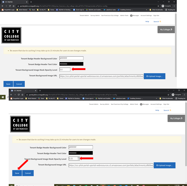
Changing the college logo image and content can be done through a content editor. Use the following steps to add or update the college logo in your college portal:
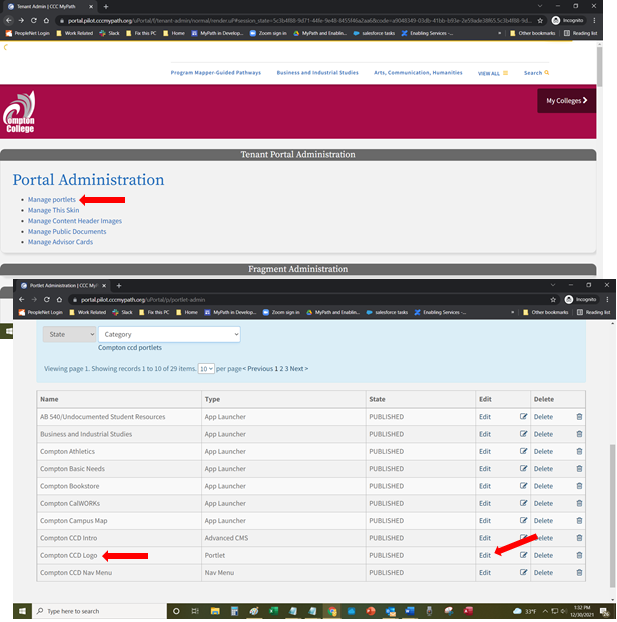
Navigate to Tenant Admin tab -> Tenant Portal Administration panel -> Manage Portlets link.
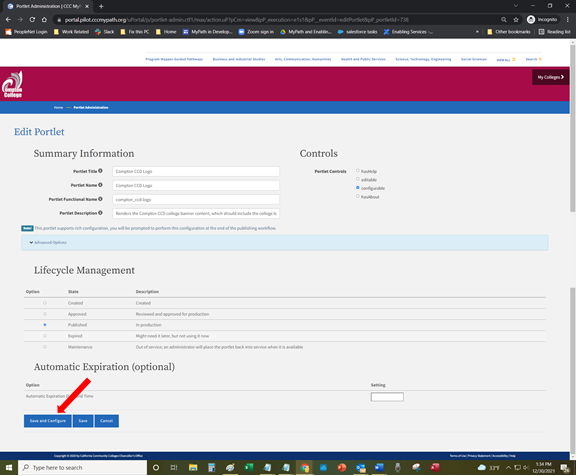
Select the Edit button corresponding to the logo (Demonstration College Logo).
Click the Save and Configure button at the bottom of the page to see the Content Editor screen.
Delete the current logo (if a logo is present) by either clicking on the right side of the logo and hitting your keyboard's backspace key or by selecting the logo image and hitting the Delete key.
Click the image icon in the toolbar to open the Image Properties dialog box.
Click the Upload tab.
Click the Choose File button to navigate and select a logo image from your local computer. Once selected, click the Send it to the Server button to send the logo image to the portal server and display the Image Info tab.
Populate the Alternative Text field with text describing the image.
Click OK to save your new logo and return to the Content Editor screen with your new logo displayed.
Click anywhere in the text field and edit the current content you want to display.
Use the editing tools inside the Content Editor screen to select the font size, color, format etc.
Click the Save icon to save your logo, close the Content Editor screen, and return to the Tenant Admin tab.
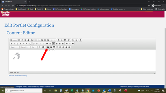
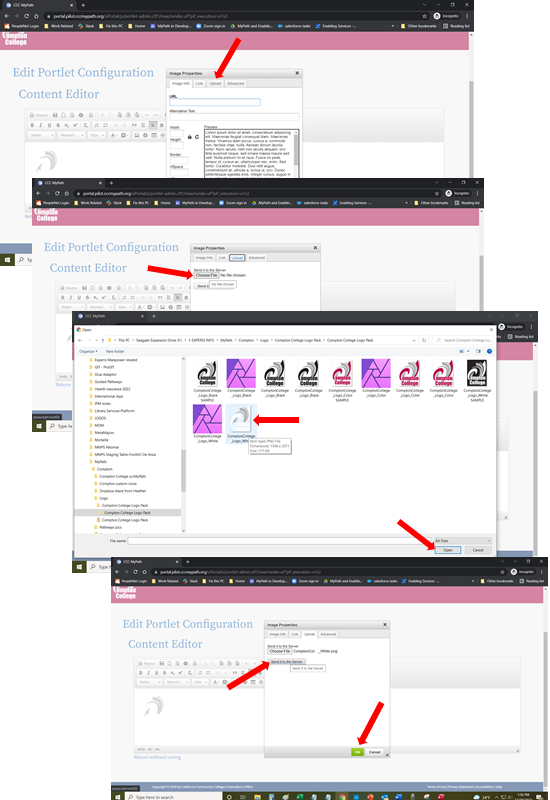
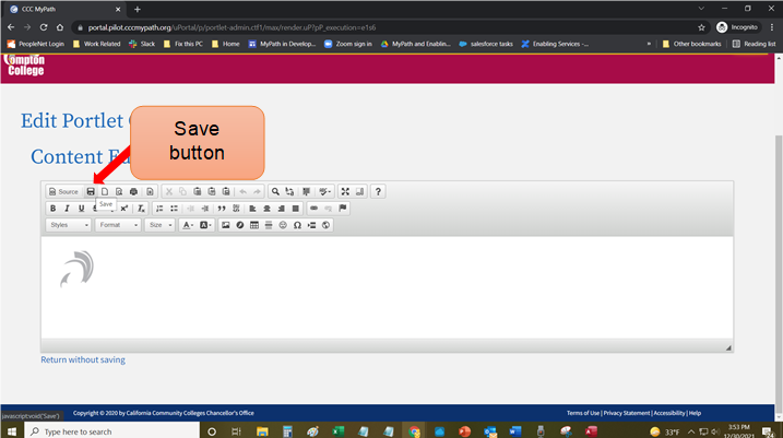
The college portal administrator manages the content of their college's portal by creating portlets using a variety of built-in portlet tools. The portlets you can create include:
Static content portlets
Surveys (with smart forms)
Advisor cards (with notifications)
The college portal administrator manages content by creating specific portlets and then adding or removing them for specified user groups, applying portlet expiration dates, etc. The steps to do all of this are included within the instructions for creating each of the different portlets currently available, including:
Surveys
Advisor Cards
Anything that you create or configure to display inside your college portal is considered a portlet. A portlet is basically a "container" for the thing you are creating or configuring to display.
College portal administrators determine which groups can have access to any given portlet as well as configuring active and inactive date ranges for portlets, also known as the portlet lifecycle.
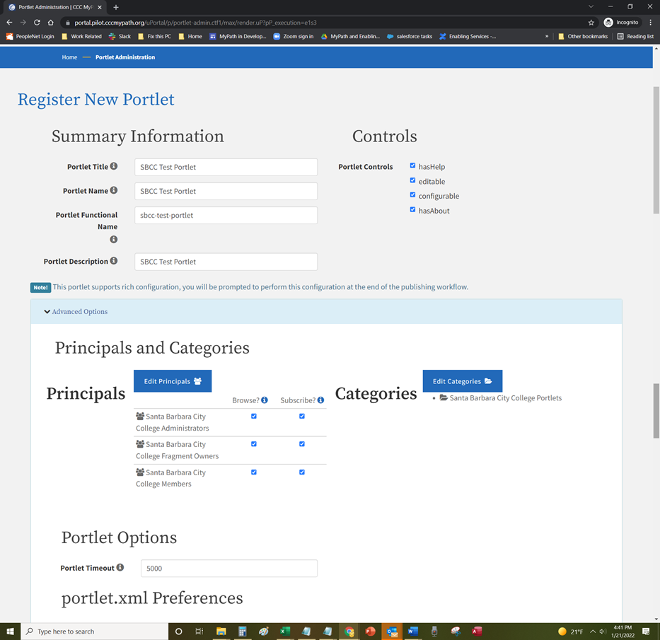
The lifecycle for any portlet can be defined by the college administrator by selecting the options in the Lifecycle Management and optional Automatic Expiration sections. You control the status and display of any and all portlets for your college.
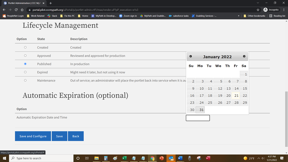
Use the following steps to manage Portlet Lifecycle Management for existing portlets:
Navigate to Tenant Admin tab-> Portal Administration panel-> Manage portlets link to display the Portlet Registry screen.
When you click the Edit link for a portlet the Edit Portlet screen will be displayed.
Scroll down to the Lifecycle Management section and click the Option radio button that corresponds to the portlet state of Created, Approved, Published, Expired or Maintenance as needed.
If you want to set an optional expiration date for the portlet (only available when Approved or Published is selected), scroll down to the Automatic Expiration (optional) section and click in the Setting field to display a pop-up calendar where you can choose an expiration date.
After selecting the expiration date, drop-down list will be displayed so you can select the time (hour, minutes, and period of the day (AM or PM)) the portlet will expire.
[ add all the screen shots in this section as needed ]
Note: When the selected date and time are reached, the portlet will no longer display in the Portal and its state will automatically revert to the Option of Expired.
Note: When the selected date and time are reached, the portlet will no longer display in the Portal and its state will automatically revert to the Option of Expired.
See:
Static content portlets contain simple content. Use the following steps to create a content portlet that you can add to your portal:
Navigate to Tenant Admin tab -> Tenant Portal Administration panel -> Manage portlets link to display the Portlet Registry screen.
Click the Register New Portlet button to display the Register New Portlet screen.
Select the Advanced CMS radio button and click the Continue button to display the Summary Information and Controls field groups.
Edit the value in the Portlet Title field to create the title for your content portlet.
Optional Step: Enter a value in the Portlet Description field. This is an optional field but the value you enter here can be used when searching for a portlet.
Click the Advanced Options link to expand and display the Principals and Categories configuration field group.
Note: As you type the Portlet Title, the Portlet Name and Portlet Functional Name fields auto-populate with the same name. The Portlet Functional Name repeats the title as a lower-case, hyphenated version of the portlet title.
Note: As you type the Portlet Title, the Portlet Name and Portlet Functional Name fields auto-populate with the same name. The Portlet Functional Name repeats the title as a lower-case, hyphenated version of the portlet title.
Optional steps for editing the principals associated with the portlet. The default principals and their permissions are:
College Administrators with Browse and Subscribe.
College Fragment Owners with Browse and Subscribe.
College Members with Browse and Subscribe.
7. Under the Principals and Categories section again, click the Edit Principals button to display the Select People and Groups screen.
8. Click the Add to Selection button for each group that you want to access this content portlet or the Remove from Selection button to remove access for the corresponding group or groups.
9. Click Save when done to save your changes and return to the Register New Portlet screen.
10. Select the appropriate checkbox permissions for each principal.
Note: As you type the Portlet Title, the Portlet Name and Portlet Functional Name fields auto-populate with the same name. The Portlet Functional Name repeats the title as a lower-case, hyphenated version of the portlet title.
Note: As you type the Portlet Title, the Portlet Name and Portlet Functional Name fields auto-populate with the same name. The Portlet Functional Name repeats the title as a lower-case, hyphenated version of the portlet title.
[ add the two screen shots for this section ]
Note: Two different permissions govern users' access to portlets once they are published: BROWSE and SUBSCRIBE.
Note: Two different permissions govern users' access to portlets once they are published: BROWSE and SUBSCRIBE.
SUBSCRIBE grants ability to use, render, run, exercise the content.
BROWSE grants ability to find the content in the user’s search.
Granting SUBSCRIBE and BROWSE yields a typical experience. Users can search and find the portlet, add it to their layout, and launch it.
Granting SUBSCRIBE but not BROWSE grants ability to use portlet but suppresses it from searches. Useful for a portlet you want students to use, such as the Nav Menu, but not find in their searches.
Granting BROWSE but not SUBSCRIBE grants ability to find the content, read about it, but not launch it or add it to your layout. This was intended to facilitate support and assistance use cases. Academic advisors might need to find, read about, see screenshots of, know the URL of, a portlet that summarizes a user's enrolled courses, say, even though those advisors do not themselves have courses.
Denying both BROWSE and SUBSCRIBE makes the content totally unavailable to the user.
11. Click the Advanced Options link to expand and display the Principals and Categories configuration field group.
Note: Steps 12-14 are optional steps for editing the categories associated with the portlet. The default category is College Portlets.
Note: Steps 12-14 are optional steps for editing the categories associated with the portlet. The default category is College Portlets.
12. Under the Principals and Categories section again, click the Edit Categories button to display the Select Categories screen.
[ screen shot ]
13. Click the Add to Selection button for each of the categories in which you want the content portlet to be associated with or the Remove from Selection button to remove the corresponding category from the content portlet.
[ screen shot ]
Note: The Add to Selection button toggles to display as Remove from Selection after you click it to select that category. The selected category displays in the Your Selections field on the right after you select it.
Note: The Add to Selection button toggles to display as Remove from Selection after you click it to select that category. The selected category displays in the Your Selections field on the right after you select it.
14. Click Save when done to save your changes and return to the Register New Portlet screen.
15. Click the Advanced Options link to expand and display the Display Settings field group.
16. Scroll down to view the Display Settings field group, click the Chrome Style drop-down list and select no-chrome.
[ screen shot ]
17. Scroll down to the Lifecycle Management field group and select the Published radio button.
[ screen shot ]
Note: The life cycle of the portlet can be modified as defined in the Portlet Lifecycle section.
Note: The life cycle of the portlet can be modified as defined in the Portlet Lifecycle section.
18. Click Save and Configure to save your content portlet and display the Edit Portlet Configuration content Editor screen.
19. Enter and format the content you want to display in the portlet. If you are familiar with HTML, CSS, or Javascript, you may edit the portlet's code by clicking the Source button. To embed a video in your new content portlet, see:
Note: CKEditor won't always keep code entered into it from Source exact, so having a local copy is important.
Note: CKEditor won't always keep code entered into it from Source exact, so having a local copy is important.
[ screen shot ]
Note: The Content Management portlet comes with four templates. Click the Template icon to open the Content Templates dialog box and select the desired template.
Note: The Content Management portlet comes with four templates. Click the Template icon to open the Content Templates dialog box and select the desired template.
20. Click the Save icon to save your configuration and return to the Portlet Registry screen with your new content portlet displayed in the list of portlets.
[ screen shot ]
Note: A green-highlighted message displays at the top of the screen confirming your registered content portlet and includes a Manage DLM Fragments link.
Note: A green-highlighted message displays at the top of the screen confirming your registered content portlet and includes a Manage DLM Fragments link.
21. Click the Manage DLM Fragments link to open the Fragment Administration screen.
[ screen shot ]
22. To add your new content portlet to a tab, see: Adding Content to a Tab.
Tenant Admins can embed videos hosted by other services into content portlets using the iframely proxy service which supports YouTube and over 1800 other content provides. Before you embed a YouTube video into a content portlet, you must get the code from YouTube.
Go to YouTube and locate the video you want to embed into your content portlet.
Click the Share link below the video.
Click the Embed link to display the HTML code for embedding the video.
Click the SHOW MORE link to expand the video options.
From the Video size drop-down list, select the size that will be displayed in the content portlet.
Optional Step: Unselect the Show suggested videos when the video finishes checkbox.
Copy the code from the form field and paste it in a text document. Once you have the code for you YouTube video, you can now embed the video into your content portlet.
Return to MyPath, click in the editor, and position the cursor where you want the video to be positioned.
Click the iFrame icon to open the iFrame Properties dialog box.
Copy the width from the YouTube code collected in step 7 and paste it in the Width field.
Copy the height from the YouTube code collected in step 7 and paste it in the Height field.
Copy the URL from the YouTube code collected in step 7 and paste it in the URL field.
Click the OK button.
[ screen shots ]
Note: If you select the Show suggested videos when the video finishes checkbox, unwanted or inappropriate suggestions may appear.
Note: If you select the Show suggested videos when the video finishes checkbox, unwanted or inappropriate suggestions may appear.
Note: You will see a box containing a red box and IFRAME within it. It doesn't looks like a video, but this is where the video will appear in the content portlet.
Note: You will see a box containing a red box and IFRAME within it. It doesn't looks like a video, but this is where the video will appear in the content portlet.
14. Click the Save icon to save your configuration and return to the Portlet Registry screen with your new content portlet displayed in the list of portlets.
Note: To view the content portlet with the embedded video, type the portlet’s name in the Search field, and select the content portlet from the search results list.
Note: To view the content portlet with the embedded video, type the portlet’s name in the Search field, and select the content portlet from the search results list.
[ screen shot ]
The OzPlayer is an “overlay” that replaces the standard HTML5 media elements with accessible buttons and controls supporting a variety of assistive technologies as well as standard keyboard commands. The OzPlayer meets WCAG 2.0, Level AA requirements and supports the playback of local media content as well as YouTube and Vimeo Pro videos. The CCC Technology Center and CCC Accessibility Center have acquired a license for California Community Colleges to use at no cost for college and district websites and affiliated projects.
The Oz Player files can be sourced from a college’s web server or the player content-delivery network (CDN). College domains must be whitelisted before they will function with the CDN solution.
Register your college domain at: https://docs.google.com/forms/d/e/ 1FAIpQLSfne5p_YXsKc4hbpFg_58Hy-OtYfcOsf7XXCDBI2zpJWDC-_A/viewform
Enter your first and last name in the Name field.
Enter your email address in the Email address field.
From the School/District Affiliation drop-down list, select your college.
Enter your college’s website name in the Please identify the College domain names you wish to register for the Oz Player CDN field.
Select the appropriate radio button for the Do you need the Oz Player source files to host on your local web server? question.
Click the Submit button.
Note: Approval can take up to 2 business days.
Note: Approval can take up to 2 business days.
Once the college domain is approved, proceed to the OzPlayer Code Generator to create the appropriate code: http://www.accessibilityoz.com/ozplayer/ozplayer-code-generator-commercial/
Enter the video’s URL in the Video URL (required) field.
Note: All URLs must be complete, including the protocol (e.g., http or https).
Note: All URLs must be complete, including the protocol (e.g., http or https).
b. From the Video type drop-down list, select the appropriate type (i.e., YouTube or MP4).
c. Optional Step: Enter a URL to an image in the to the Poster URL field.
Note: If using YouTube as the source, leave blank.
Note: If using YouTube as the source, leave blank.
d. From the Player color drop-down list, select the preferred color of buttons for your version of the OzPlayer.
e. Select the Transcript open by default? checkbox to have immediately display the Video Transcript dialog box.
f. Enter the appropriate ISO language code in the Languages field. Note: If the captions are in English, leave the Language field as “en”.
g. Enter a unique value in the Video ID field (e.g., videoName_date, etc.) if there will be more than one video per page.
h. Enter the URL to the caption file in the Captions (VTT) URL field.
Note: This is often easiest to upload your caption file to the server and then determine the full URL to the file. This must be a .VTT file.
Note: This is often easiest to upload your caption file to the server and then determine the full URL to the file. This must be a .VTT file.
i. Optional Step: Enter the URL to the Transcript Extras in the Transcript extras (VTT) URL field.
Note: Transcript Extras file can be used to describe visual details, such as text shown on the screen, and to transcribe the spoken text of audio descriptions. This file will also have to be a .VTT file and synchronized with the original video.
Note: Transcript Extras file can be used to describe visual details, such as text shown on the screen, and to transcribe the spoken text of audio descriptions. This file will also have to be a .VTT file and synchronized with the original video.
j. Click the Submit button. A text area will appear at the top of the page with the HTML code you need to insert in your page to make the video player appear and function.
Once the OzPlayer code has been developed, you can now add it to your content portlet.
3. Remove the following script from the OzPlayer code:
<script type="text/javascript" src=“https://ozplayer-commercial.global.ssl.fastly.net/3.0/ozplayer-core/mediaelement.min.js"></script>
4. Verify the code is using version 3.0 and not 2.0. If needed, change the version to 3.0 for the following links and scripts in the code:
<link href="https://ozplayer-commercial.global.ssl.fastly.net/3.0/ozplayer-core/ozplayer.min.css" media="all" rel="stylesheet" type="text/css" /> <link href="https://ozplayer-commercial.global.ssl.fastly.net/3.0/ozplayer-skin/highlights-blue.css" media="all" rel="stylesheet" type="text/css" /> <link href="https://ozplayer-commercial.global.ssl.fastly.net/3.0/transcript.css" media="all" rel="stylesheet" type="text/css" /> <script type="text/javascript" src="https://ozplayer-commercial.global.ssl.fastly.net/3.0/ozplayer-core/ozplayer.min.js"></script> <script type="text/javascript" src="https://ozplayer-commercial.global.ssl.fastly.net/3.0/ozplayer-lang/en.js"></script> <script type="text/javascript" src="https://ozplayer-commercial.global.ssl.fastly.net/3.0/config.js"></script>
5. Return to MyPath and click the Source icon to switch from WYSIWYG mode to Source (HTML) mode.
[ screen shot ]
6. Copy the OzPlayer code created in step 2 with the edits made in steps 3 and 4, and paste it where you want the video to be positioned.
[ screen shot ]
7. Click the Source icon to switch from the Source (HTML) mode back to the WYIWYG mode.
[ screen shot ]
8. Click the Save icon to save your configuration and return to the Portlet Registry screen with your new content portlet displayed in the list of portlets.
Note: To view the content portlet and the embedded video with the OzPlayer interface, type the portlet’s name in the Search field, and select the content portlet from the search results list.
Note: To view the content portlet and the embedded video with the OzPlayer interface, type the portlet’s name in the Search field, and select the content portlet from the search results list.
Tenant Admins can upload banner style images from their hard drives that can be specified for use in content portlet. These images can be used for single or multiple content portlets.
Navigate to Tenant Admin tab -> Portal Administration panel -> Manage Content Header Images link to display the Portlet Header Image Admin screen.
Click the Choose File button to navigate and select an image from your local computer.
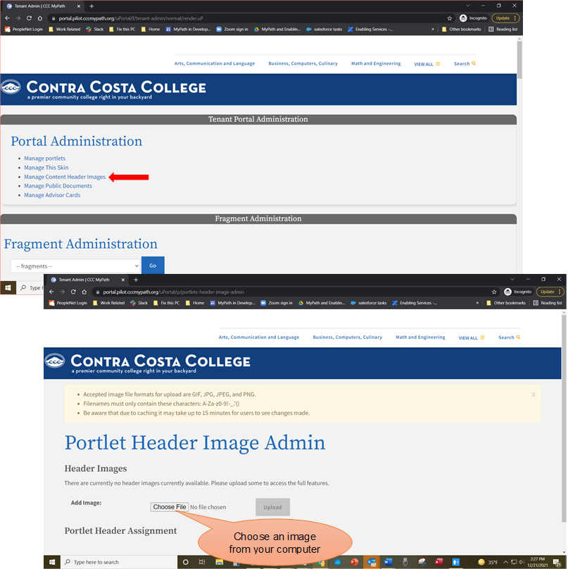
Note: The Suggested image size is 350px high and a minimum of 1170px wide.
Note: The Suggested image size is 350px high and a minimum of 1170px wide.
3. Click the Upload button to add the image to the Header Images section.
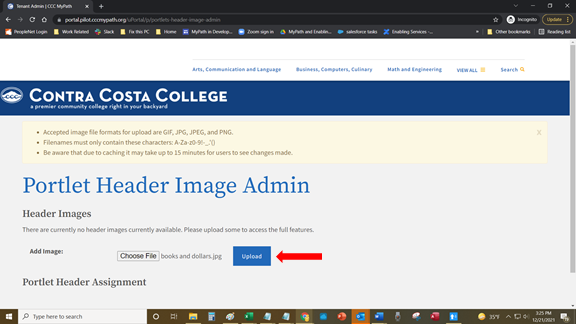
Note: Once an image has been uploaded, the Portlet Name drop-down list and Assigned Header Image drop-down list will be displayed in the Portlet Header Assignment section.
Note: Once an image has been uploaded, the Portlet Name drop-down list and Assigned Header Image drop-down list will be displayed in the Portlet Header Assignment section.
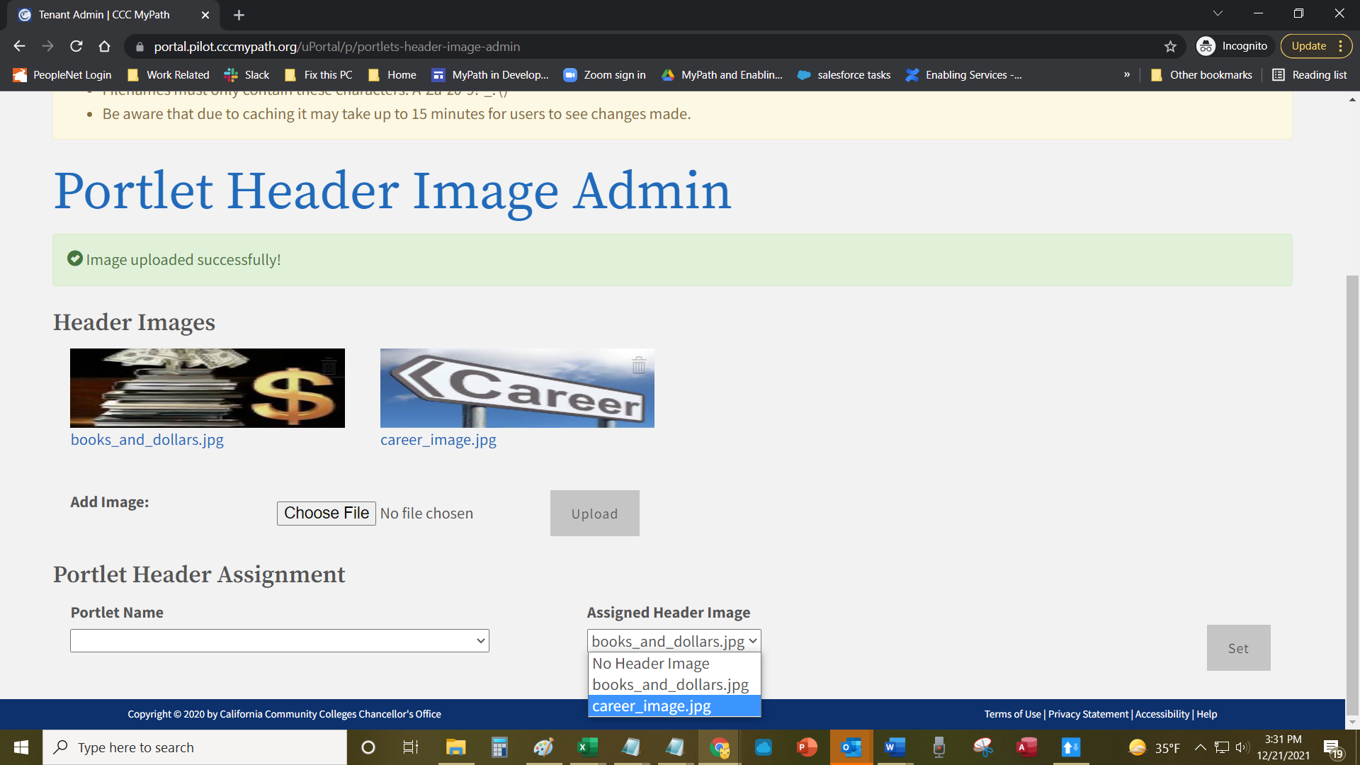
4. From the Portlet Name drop-down list, select the content portlet you want to add a header image to.
5. From the Assigned Header Image drop-down list, select the image you want assigned to the content portlet.
6. Click the Set button to add the header image to the content portlet.
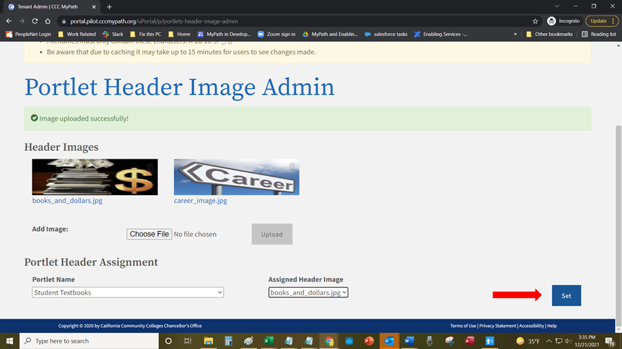
Note: After an image is assigned to a content portlet, the image will be displayed showing which content portlets are currently associated to it.
Note: After an image is assigned to a content portlet, the image will be displayed showing which content portlets are currently associated to it.
[ screen shot ]
7. Go to the Search field at the top of the page, enter the name of the content portlet with attached the header image, and select the it from the list.
Note: Header images associated with content portlets appear in the space between the bread crumb and the page header. Due to caching it may take up to 15 minutes for users to see changes made.
Note: Header images associated with content portlets appear in the space between the bread crumb and the page header. Due to caching it may take up to 15 minutes for users to see changes made.
Header images can be updated after one has been added to a content portlet.
Navigate to Tenant Admin tab -> Portal Administration panel -> Manage Content Header Images link to display the Portlet Header Image Admin screen.
From the Portlet Name drop-down list, select the content portlet you want to edit.
Note: When you select a portlet from the Portlet Name drop-down list, the Assigned Header Image drop-down list is auto-populated with the header image associated with the portlet.
Note: When you select a portlet from the Portlet Name drop-down list, the Assigned Header Image drop-down list is auto-populated with the header image associated with the portlet.
3. From the Assigned Header Image drop-down list, select the new image you want assigned to the content portlet.
Note: An option within the Assigned Header Image drop-down list is No Header Image. Selecting this option will remove a header image from the content portlet.
Note: An option within the Assigned Header Image drop-down list is No Header Image. Selecting this option will remove a header image from the content portlet.
4. Click the Set button to update the header image to the content portlet.
Header images previous added to a content portlet can be removed so that no image is in place after one had been added to a content portlet.
Navigate to Tenant Admin tab -> Portal Administration panel -> Manage Content Header Images link to display the Portlet Header Image Admin screen.
Click on the header image attached to the content portlet.
Note: The image is displayed, listing the content portlets assigned to it.
Note: The image is displayed, listing the content portlets assigned to it.
[ screen shot ]
3. Click the trash icon for the corresponding content portlet to remove the portlet from the image.
[ screen shot ]
Images previously uploaded and not attached to a content portlet can be deleted from the Portlet Header Image Administration portlet.
Navigate to Tenant Admin tab -> Portal Administration panel -> Manage Content Header Images link to display the Portlet Header Image Admin screen.
Place the cursor over the image you want to delete. A trash icon appears in the top, right corner of the image.
[ screen shot ]
Note: A trash icon appears in the top, right corner of the image.
3. Click the trash icon to delete the image.
Note: If the image is attached to one or more content portlets, all portlets associated to the image must be removed before it can be deleted. A list of portlets assigned to the image is display.
[ screen shot ]
4. Click the trash icon for each content portlet attached to the image.
5. Once all of the content portlets are removed, click the trash icon to delete the image.
6. Click on the Delete button on the Confirm Delete confirmation modal.
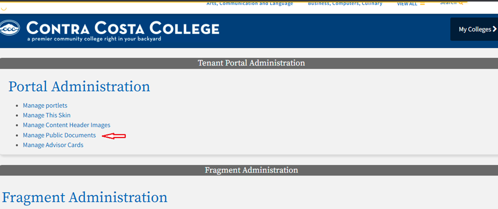
Tenant Admins can upload documents (.jpg, .zip, .tar, .gif, .csv, .png, .txt, .pdf, .gz, .json, and .doc(x)) from their hard drives that can be attached to a content portlet or an advisor card task, and made available to students for download. These files can be used for single or multiple content portlets or advisor cards.
Navigate to Tenant Admin tab -> Portal Administration panel -> Manage Public Documents link to display the Public Document List Admin screen.
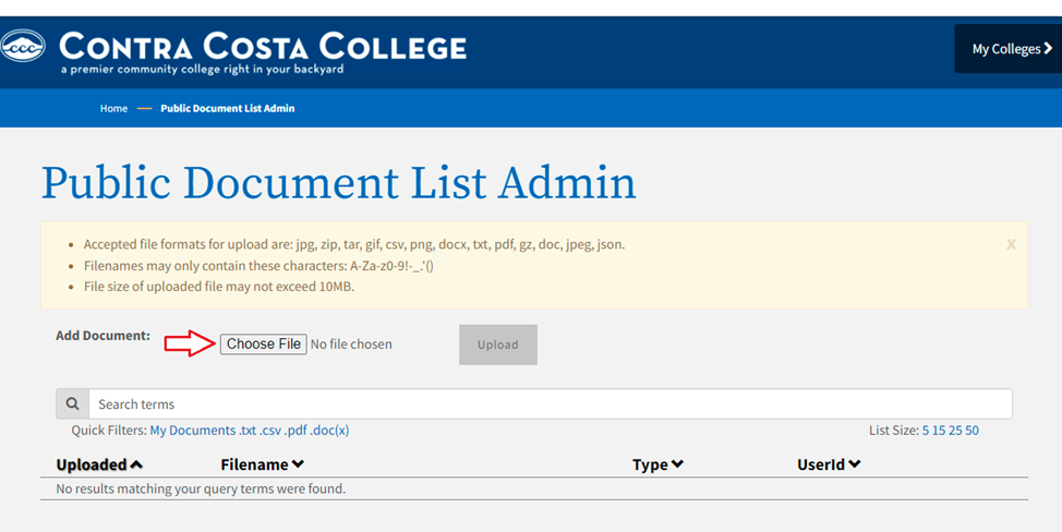
2. Click the Choose File button to navigate and select a document from your local computer.
3. Click the Upload button to add the document to the list of documents available to be attached to content portlets.
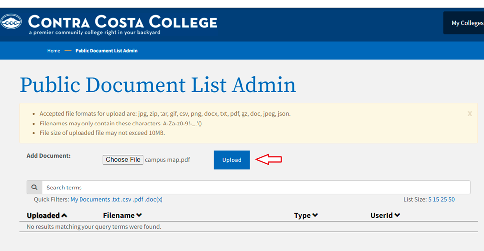
Note: Once a document has been uploaded, the Portlet Name drop-down list and Document to Assigned drop-down list will be displayed in the Attach Document to Portlet section.
4. From the Portlet Name drop-down list, select the content portlet you want to attach a document to.
5. From the Document to Assigned drop-down list, select the document you want attached to the content portlet.
6. Click the Set button to attach the document to the content portlet.
7. To attach another document to the content portlet, select a different document from the Document to Assigned drop-down list, and click on the Set button.
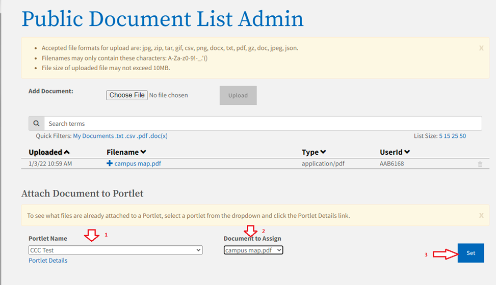
One or more documents previously added to content portlets can be removed.
1. Navigate to Tenant Admin tab -> Portal Administration panel ->Manage Public Documents link to display the Public Document List Admin screen.
2. From the Portlet Name drop-down list, select the content portlet you want to remove documents from.
Note: After a content portlet is selected from the Portlet Name drop-down list, the Portlet Details link is displayed.
Note: After a content portlet is selected from the Portlet Name drop-down list, the Portlet Details link is displayed.
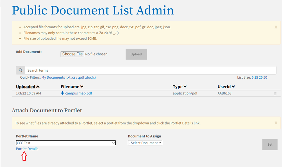
3. Click the Portlet Details link to display the list of documents attached to the content portlet.
4. Within the Attached Documents sections, click the delete link of the corresponding document to be remove from the content portlet.
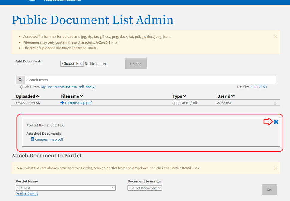
5. To remove additional documents from the content portlet, click the delete links of the corresponding documents you want to detach.
Documents previously uploaded and not attached to a content portlet or an advisor card task can be deleted from the Public Document List Administration portlet.
Navigate to Tenant Admin tab -> Portal Administration panel ->Manage Public Documents link to display the Public Document List Admin screen.
Click the trash icon for the corresponding document to remove from the list.
Note: If the document is attached to a content portlets, all associated to the document must be removed before it can be deleted. A list of portlets assigned to the document is displayed.
Note: If the document is attached to a content portlets, all associated to the document must be removed before it can be deleted. A list of portlets assigned to the document is displayed.
3. If a content portlet or multiple portlets are attached to the file you are trying to delete, click the trash icon for each content portlet attached to the document.
Note: Once all of the associated content portlets are removed from the document, the Delete Document button will appear.
Note: Once all of the associated content portlets are removed from the document, the Delete Document button will appear.
4. Click the Delete Document button.
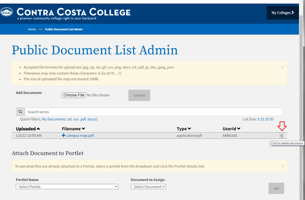
Note: If the document is attached to an advisor card task, all associated tasks to the document must be removed before it can be deleted.
Note: If the document is attached to an advisor card task, all associated tasks to the document must be removed before it can be deleted.
An App Launcher is a portlet that launches an application in a detached window view.
Use the following steps to create an App Launcher that you can add to your portal:
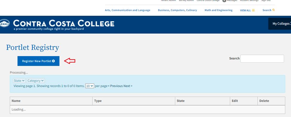
Navigate to Tenant Admin tab -> Portal Administration panel -> Manage portlets link to display the Portlet Registry screen.
Click the Register New Portlet button to display the Register New Portlet screen.
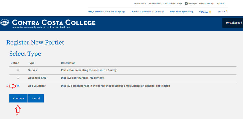
3. Select the App Launcher radio button and click the Continue button to display the Summary Information and Controls field groups.
4. Edit the value in the Portlet Title field. This is the public name for the portlet. It is the text used in navigational menus and searches.
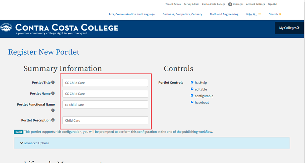
Note: As you type the Portlet Title, the Portlet Name and Portlet Functional Name fields auto-populate with the same name. The Portlet Functional Name repeats the title as a lower-case, hyphenated version of the portlet title.
Note: As you type the Portlet Title, the Portlet Name and Portlet Functional Name fields auto-populate with the same name. The Portlet Functional Name repeats the title as a lower-case, hyphenated version of the portlet title.
5. Optional Step: Enter a value in the Portlet Description field. The description is visible on the value you enter here can be used when searching for a portlet.
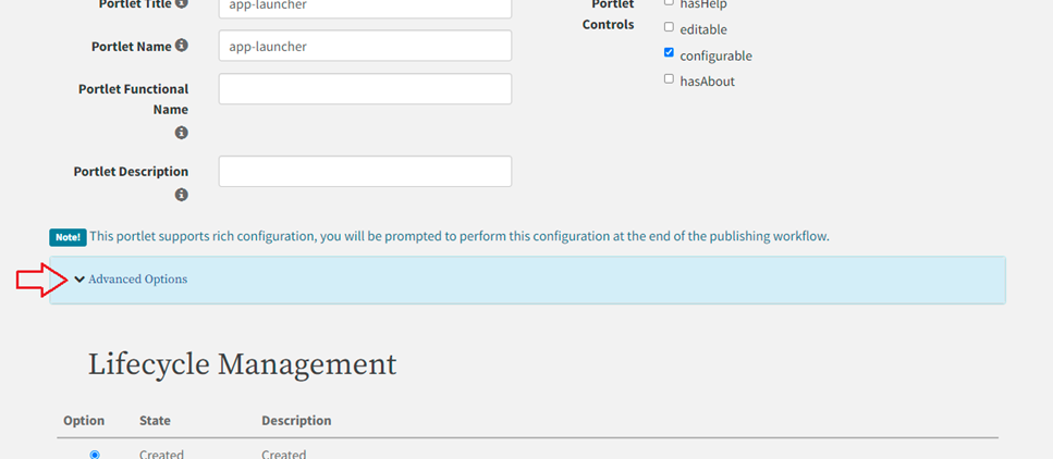
6. Click the Advanced Options link to expand and display the Principals and Categories configuration field group.
Note: Steps 7-10 are optional steps for editing the principals associated with the portlet.
Note: Steps 7-10 are optional steps for editing the principals associated with the portlet.
The default principals and their permissions are:
College Administrators with Browse and Subscribe.
College Fragment Owners with Browse and Subscribe.
College Members with Browse and Subscribe.
7. Under the Principals and Categories section again, click the Edit Principals button to display the Select People and Groups screen.
8. Click the Add to Selection button for each group that you want to access this content portlet.
Note: The Add to Selection button toggles to display as Remove from Selection after you click it to select that group. The selected group displays in the Your Selections field on the right after you select it.
Note: The Add to Selection button toggles to display as Remove from Selection after you click it to select that group. The selected group displays in the Your Selections field on the right after you select it.
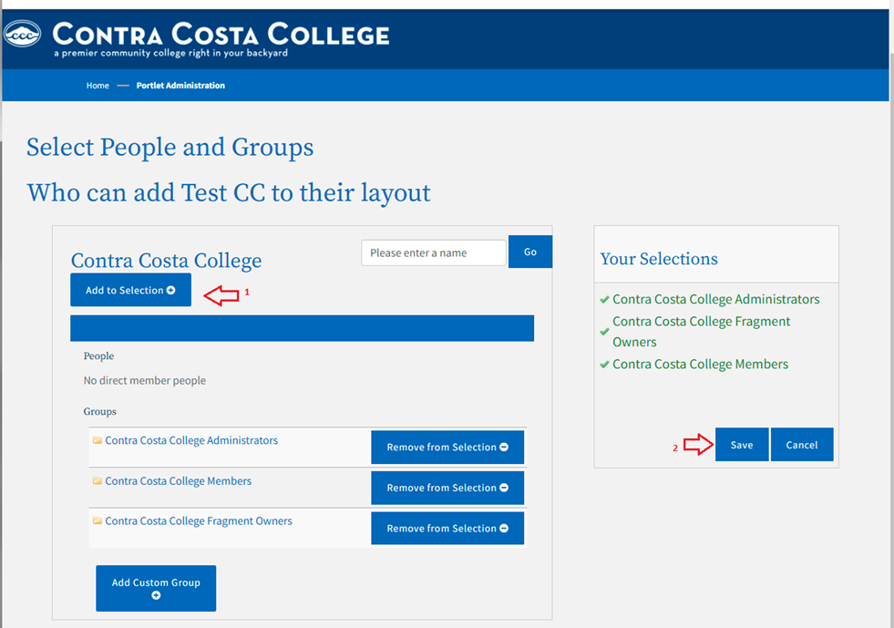
9. Click Save when done to save your changes and return to the Register New Portlet screen.
10. Select the appropriate checkbox permissions for each principal.
Note: Two different permissions govern users' access to portlets once they are published: BROWSE and SUBSCRIBE.
Note: Two different permissions govern users' access to portlets once they are published: BROWSE and SUBSCRIBE.
SUBSCRIBE grants ability to use, render, run, exercise the content.
BROWSE grants ability to find the content in the user’s search.
Granting SUBSCRIBE and BROWSE yields a typical experience. Users can search and find the portlet, add it to their layout, and launch it.
Granting SUBSCRIBE but not BROWSE grants ability to use portlet but suppresses it from searches. Useful for a portlet you want students to use, such as the Nav Menu, but not find in their searches.
Granting BROWSE but not SUBSCRIBE grants ability to find the content, read about it, but not launch it or add it to your layout. This was intended to facilitate support and assistance use cases. Academic advisors might need to find, read about, see screenshots of, know the URL of, a portlet that summarizes a user's enrolled courses, say, even though those advisors do not themselves have courses.
Denying both BROWSE and SUBSCRIBE makes the content totally unavailable to the user.
11. Click the Advanced Options link to expand and display the Principals and Categories configuration field group.
Note: Steps 12-14 are optional steps for editing the categories associated with the portlet. The default category is College Portlets.
Note: Steps 12-14 are optional steps for editing the categories associated with the portlet. The default category is College Portlets.
12. Under the Principals and Categories section again, click the Edit Categories button to display the Select Categories screen.
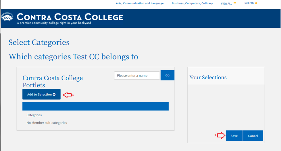
13. Click the Add to Selection button for each of the categories in which you want the App Launcher to be available.
Note: The Add to Selection button toggles to display as Remove from Selection after you click it to select that category. The selected category displays in the Your Selections field on the right after you select it.
Note: The Add to Selection button toggles to display as Remove from Selection after you click it to select that category. The selected category displays in the Your Selections field on the right after you select it.
14. Click Save when done to save your changes and return to the Register New Portlet screen.
15. Click the Advanced Options link to expand and display the Display Settings configuration field group.
16. Scroll down to the Display Settings field group, click the Chrome Style drop-down list and select no-chrome.
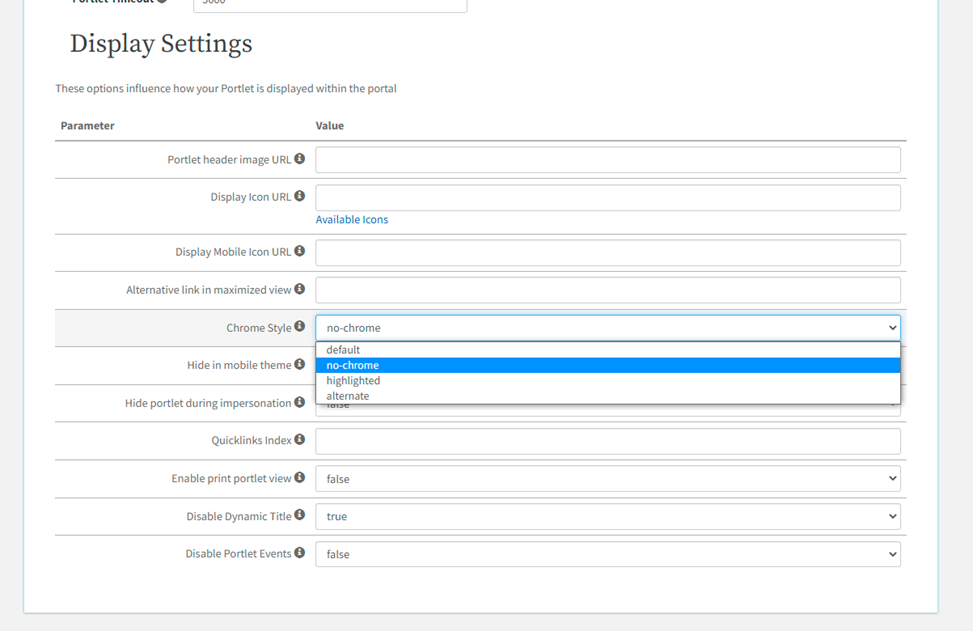
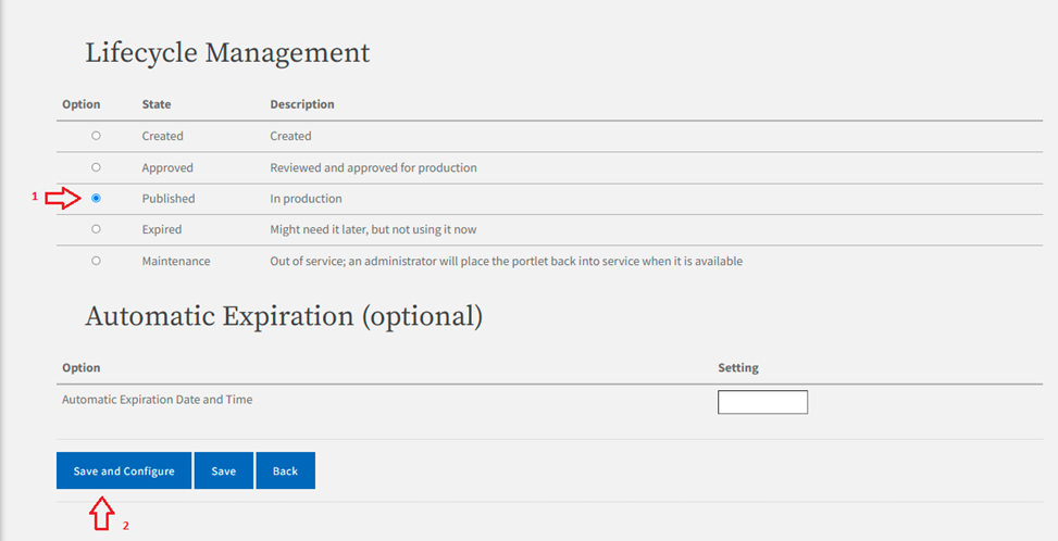
17. Scroll down to the Lifecycle Management field group and select the Published radio button.
Note: The life cycle of the portlet can be modified as defined in the Portlet Lifecycle section.
Note: The life cycle of the portlet can be modified as defined in the Portlet Lifecycle section.
18. Click Save and Configure to save your App Launcher portlet and display the Edit Portlet Configuration screen.
19. In the Edit Portlet Configuration screen, provide the following values:
Enter a value for the App URL. You must include https:// at the beginning of the URL.
Note: URLs can be set for App Launcher to pick up information about the user. Customized URLs going through the proxy can send the college's MIS Code as a parameter to an application. This can be done by appending ?cccMisCode=${user['cccMisCode']?:'000'} to the end of the URL.
Note: URLs can be set for App Launcher to pick up information about the user. Customized URLs going through the proxy can send the college's MIS Code as a parameter to an application. This can be done by appending ?cccMisCode=${user['cccMisCode']?:'000'} to the end of the URL.
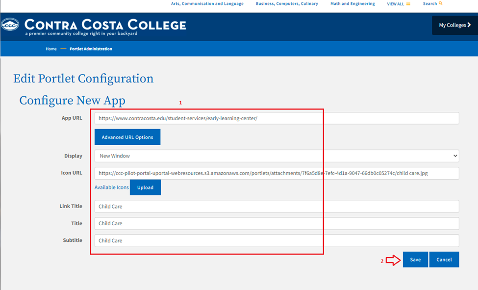
See the California Virtual Campus example below for more information:
Click the Advanced URL Options button to display view-only information on Spring EL expression options.
From the Display drop-down list, select the option for the App Launcher window to open in the student's web browser:
Detached Window State o New Window o Same Window
Choose an icon from the Available Icons link for the Icon URL field, or click the Upload link to upload an icon. This icon will display on the App Launcher portlet.
Enter text in the Link Title, Title, and Subtitle fields.
20. Click Save to save your configuration and return to the Portlet Registry screen with your App Launcher portlet displayed in the list of portlets.
Note: A green-highlighted message displays at the top of the screen confirming your registered App Launcher and includes a Manage DLM Fragments link.
Note: A green-highlighted message displays at the top of the screen confirming your registered App Launcher and includes a Manage DLM Fragments link.
21. Click the Manage DLM Fragments link to open the Fragment Administration screen.

22. To add your new App Launcher portlet to a tab, see Adding Content to a Tab.
You can add surveys to the student portal to gather information from your student population. When you create and publish a survey it appears in the Student Portal below the Advisor Cards.
Use the following steps to create a survey that you can add to your portal:
Navigate to Survey Admin tab -> Add Survey button to display the Name, Description, and Unique Name fields, as well as the Add Question, Save Changes, and Cancel buttons.
Note: The Title, Description, and Unique Name fields display with red outlines and are required. When all three fields are populated and a question is added, the Save Changes button is activated.
Note: The Title, Description, and Unique Name fields display with red outlines and are required. When all three fields are populated and a question is added, the Save Changes button is activated.


2. Enter values in the Name field to create the name for your Survey.
Note: As you type the Name, the Description and Unique Name fields auto-populate with the same name. The Unique Name repeats the title as a lower-case, hyphenated version of the survey title.
Note: As you type the Name, the Description and Unique Name fields auto-populate with the same name. The Unique Name repeats the title as a lower-case, hyphenated version of the survey title.
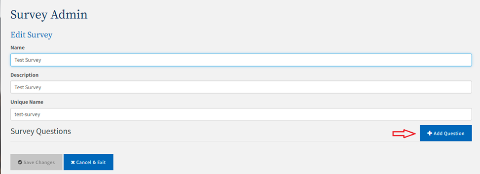
Note: Record the value in the Unique Name field as you will need it when you register your portlet in step 14f, below.
Note: Record the value in the Unique Name field as you will need it when you register your portlet in step 14f, below.
4. Click the Add Question button to add a new, blank question under the Survey Questions section.
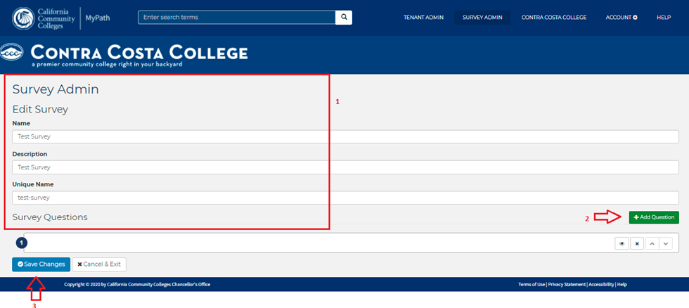
5. Click the Save Changes button. 6. Click the Open icon to display the Survey Administration Question field group and enter information for the question and its answer.
Note: The Question Text and Unique Name fields display with red outlines and are required. When both fields are populated, the Save Survey button is activated.
Note: The Question Text and Unique Name fields display with red outlines and are required. When both fields are populated, the Save Survey button is activated.
a. Enter the survey question text in the Question Text field.
Note: As you type the Question Text, the Unique Name fields auto-populate with the same name. The Unique Name repeats the title as a lower-case, hyphenated version of the survey title.
Note: As you type the Question Text, the Unique Name fields auto-populate with the same name. The Unique Name repeats the title as a lower-case, hyphenated version of the survey title.
b. Optional Step: Enter a value in the Help Text field. This is an optional field but the value you enter provide additional details/help displayed to the user’s UI.
c. Enter the number of answers/responses allowed for the question in the Allowed Answers field.
d. Click the Add button next to the Answers label to display an answer field.
Note: The answer field display with red outlines and is required. When the field is populated, the Save Survey button is activated.
Note: The answer field display with red outlines and is required. When the field is populated, the Save Survey button is activated.
e. Enter an answer to the survey question in the answer field.
f. Click Add as many times as needed to add additional answers to the question.
g. Click the green Up and Down buttons on the far right to select the order in which the answers are shown.
h. Click the Delete button on the far right to delete the corresponding answer field.
7. Click the Save Survey button.
8. Optional Step: Click the Open button to the right of the answer field to display the Survey Administration Answer field group and enter information for the answer.
a. Optional Step: Survey answers can have attributes mapped to them so when a student selects this answer, the attribute is added to their profile. First select an option from the Attribute to Map drop-down list, then select a value from the Value to Map drop-down list.
Note: The Answer Text field is updated with the selection from the Attribute to Map drop-down list. You can manually update this field after the selection is made.
Note: The Answer Text field is updated with the selection from the Attribute to Map drop-down list. You can manually update this field after the selection is made.
b. Optional Step: Enter a value in the Help Text field. The value you enter provide additional details/help displayed in the users’ UI.
c. Optional Step: Select the Show an image checkbox to display the Image URL field, Image Alternate Text field, Image Height field, and Image Width field.
d. Enter an image URL in the Image URL field to display the image next to the corresponding answer. e. Optional Step: Populate the Image Alternate Text field.
Note: The Image Alternate Text provides a clear text describing the image for screen reader users.
Note: The Image Alternate Text provides a clear text describing the image for screen reader users.
f. Optional Step: Enter and format the content you want displayed at the end of the survey to users who select this answer.
9. Optional Step: Click the Add button on the right of Actions to add an action and display the Action Type drop-down list.
Note: There are two Action Type, advisorCommandRunner and droolsRulesCommandRunner. advisorCommandRunner allow you to configure an Advisor Card to be added to the student's layout, based on their response to the survey question.
Note: There are two Action Type, advisorCommandRunner and droolsRulesCommandRunner. advisorCommandRunner allow you to configure an Advisor Card to be added to the student's layout, based on their response to the survey question.
a. Click Add as many times as needed to add additional actions to the answer.
b. Click the green Up and Down buttons on the right to select the order in which the actions are organized.
c. Click the Delete button on the right to remove an action.
d. Select the advisorCommandRunner from the Action Type drop-down list to display the Card to Add drop-down list.
e. Select the Advisor Card from the Card to Add drop-down list you want added to the student’s layout if they select this answer.
f. Select droolsRulesCommandRunner from the Action Type drop-down list to add a rule.
Note: droolsRulesCommandRunner allow you to add a rule to be executed based on student’s response to the survey question.
Note: droolsRulesCommandRunner allow you to add a rule to be executed based on student’s response to the survey question.
10. Optional Step: Click the Add button on the right of Follow-up Question to display the Question text field.
Note: The Follow-up Question are displayed based on student’s response to the survey question.
Note: The Follow-up Question are displayed based on student’s response to the survey question.
a. Click Add as many times as needed to add additional follow-up questions to the answer.
b. Click the green Up and Down buttons on the far right to select the order in which the follow-up questions are shown.
c. Click the Delete button on far right to delete a follow-up question.
d. Populate the Question Text field.
e. Click the Save Survey button.
f. Click the Open button to display the Survey Administration Question field group and enter information for the question and its answer.
11. When you complete the configuration for a survey answer, click Save Survey to save your changes.
12. Click Back to Surveys to return to the Surveys portlet where you can:
Click Edit for your survey if you want to make any more changes (add more questions/ answers, format any questions, etc.).
Click Preview to see a preview of the survey you just created.
13. When your survey is complete and you are ready to publish it, click Publish. You may see a pop-up dialog box that prompts you to confirm publication of the survey. The text (Published) appears after your survey title.
Note: Once you publish a survey, all survey fields become protected and no additional changes can be made.
Note: Once you publish a survey, all survey fields become protected and no additional changes can be made.
14. Once the survey has been completed, you must register it:
a. Register the survey portlet: Tenant Admin tab -> Tenant Portal Administration panel -> Mange Portlets link - > Register New Portlet button -> Survey radio button and click the Continue button to open the Summary Information screen.
b. The Portlet Title and Portlet Name field values are auto-populated by default. Overwrite these default values with a unique name. The Portlet Title and Portlet Name should generally be the same.
c. Enter a value in the Portlet Functional Name field. The name of your survey is a good choice here.
d. The Portlet Description field is optional, but you can enter a value here that describes your survey portlet which may be helpful.
e. Click the Advanced Options link to display the Survey Portlet Settings section.
f. Enter the Unique Name value from step 3 above in the Survey Unique Name/ID field.
Note: If you forgot the unique name you can find it by returning to the Survey Admin tab. It is listed in the middle of survey card in italics.
Note: If you forgot the unique name you can find it by returning to the Survey Admin tab. It is listed in the middle of survey card in italics.
g. Choose the Lifecycle Management option (Created, Approved, Published, Expired or Maintenance) for your survey and click Save.
h. Once your survey portlet has been successfully registered, a success confirmation message displays along with a link to Manage DLM Fragments.
10. Once you've registered your survey portlet you must use Manage DLM Fragments to make it available to students. See Adding Content to a Tab.
a. Click the drop-down list and select the college group (i.e. Your college Students) and click Go. Manage DLM Fragments link to display the Fragment Administration options.
b. Follow the instructions for Adding Content to a Tab in the link below to add the survey portlet to the student layout. See the following next topics:
Advisor Cards are tasks that display to students in the college portal beneath the background image. Once a student has completed a task, a green circle with a check will display next to the task, indicating that they finished the task. Each task has a duration and as the tasks on a card are completed, a green status bar shows current state of completion.
Use the following steps to create a new Advisor Card:
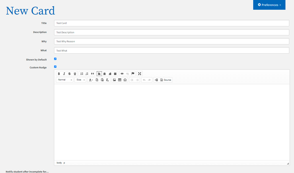
From the Tenant Admin tab -> Advisor Card Administration panel -> New Card field group, enter up to 32 characters in the Title field. This title at the top of the advisor card.
Optional Step: Enter up to 96 characters in the Description field. The description will display as the subtitle on the advisor card.
Optional Step: Enter up to 255 characters in the Why field.
Optional Step: Enter up to 255 characters in the What field.
If you want the advisor card to immediate appear in your students’ Advisor Card portlet, select the Shown by default check box.
Optional Step: Select one or more of the notifications check boxes to automatically send reminders to students who have unfinished Advisor Cards. (Tenant Admins can schedule single or multiple notifications per Advisor Card to be sent out at 24 hours, 48 hours, or 7 days.)
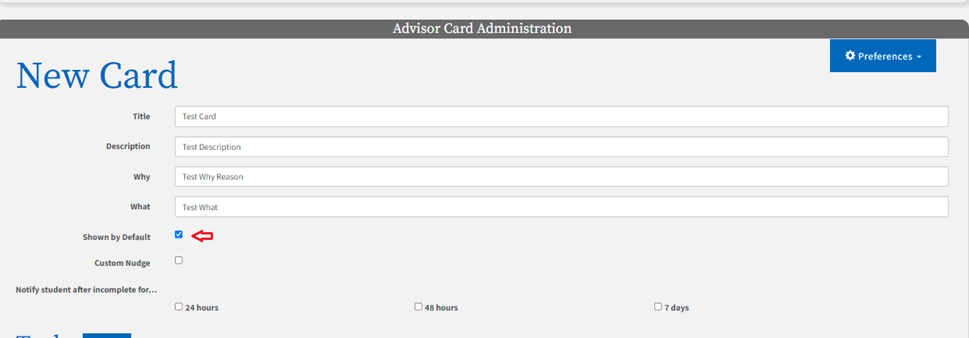
Note: The first notification is triggered based on the Advisor Card’s position (first card displayed in the student’s Advisor Card portlet).
Note: The first notification is triggered based on the Advisor Card’s position (first card displayed in the student’s Advisor Card portlet).
For Advisor Cards not appearing first in the student’s portlet, notifications are triggered once all the tasks on the cards before it have been completed.
Below is the template of the message with the <advisor card name> a link returning the user to CCC MyPath:
Hi <student’s first name><student’s last name>,
<College Name> would like to remind you that there are some important tasks waiting for you at CCC MyPath!
Please come back and get started with <advisor card name>.
7. Optional Step if a notification is associated with the Advisor Card: Select the Custom Nudge check box to edit the notification message being sent for this card.
Note: When the Custom Nudge is selected a content editor is opened displaying the default message.
Note: When the Custom Nudge is selected a content editor is opened displaying the default message.
8. Enter up to 36 characters in the task Title field.
Note: The task title will display as a link to the URL entered in the task Link field in step 10, below.
Note: The task title will display as a link to the URL entered in the task Link field in step 10, below.
9. Enter up to 120 characters in the task Description field.
10. Click the Link drop-down list and select the link type.
Note: There are three Link Types: Link, Upload and Download.
Note: There are three Link Types: Link, Upload and Download.
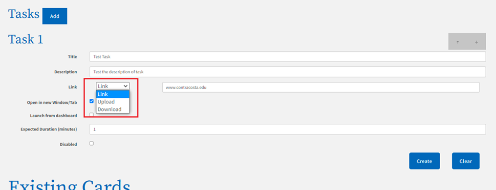
A Link can connect to an external site or an internal portlet.
Upload allows students to upload files to the instructor.
Download provides the ability to upload a file that can be downloaded by students clicking on the task.
To add a Link:
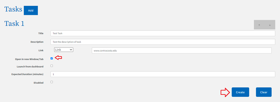
a. Select the Link option from the Link drop-down list. This is the default option in the Link drop-down list.
b. Enter up to 2000 characters in the task Link field. This is the URL that the student will be taken to when they click the task title entered in step 8, above.
c. Continue to step 11.
Note: As values are entered into the Link field, search results matching the entered values will be displayed for selection.
Note: As values are entered into the Link field, search results matching the entered values will be displayed for selection.
See Custom URLs on how to create customized links.
To allow students to Upload a file:
a. Select the Upload option from the Link drop-down list.
b. Optional Step: Enter up to 64 characters in the Category field.
c. Continue to step 13.
Note: Once the Upload option is selected, the Open in new Window/Tab and Launch from dashboard check boxes will be selected and hidden so the user cannot edit them.
Note: Once the Upload option is selected, the Open in new Window/Tab and Launch from dashboard check boxes will be selected and hidden so the user cannot edit them.
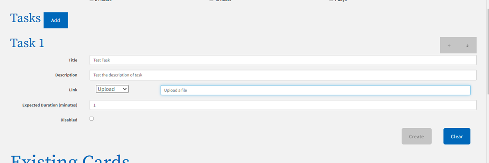
Note: The category you enter will be assigned to the document the student uploads. The field only accepts alphanumeric characters and dashes.
Note: The category you enter will be assigned to the document the student uploads. The field only accepts alphanumeric characters and dashes.
To Download a file from the Public Documents portlet:
a. Select the Download option from the Link drop-down list.
b. Click on the Use a Public Document drop-down to display the list of available documents.
Note: Once the Download option is selected, the Open in new Window/Tab and Launch from dashboard check boxes will be selected and hidden so the user cannot edit them.
Note: Once the Download option is selected, the Open in new Window/Tab and Launch from dashboard check boxes will be selected and hidden so the user cannot edit them.
c. Select a document from the list by clicking on it.
Note: Once the file is selected the Download field is populated with the path where the file is being stored in MyPath.
Note: Once the file is selected the Download field is populated with the path where the file is being stored in MyPath.
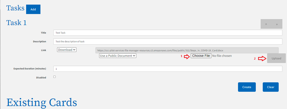
d. Continue to step 13.
To Download a file from your computer:
a. Select the Download option from the Link drop-down list.
Note: Once the Download option is selected, the Open in new Window/Tab and Launch from dashboard check boxes will be selected and hidden so the user cannot edit them.
Note: Once the Download option is selected, the Open in new Window/Tab and Launch from dashboard check boxes will be selected and hidden so the user cannot edit them.
b. Click the Choose File button to navigate and select a document from your local computer.
[ screen shot ]
Note: Once a file has been selected the green Upload button to the right is activated.
Note: Once a file has been selected the green Upload button to the right is activated.
c. Click the Upload button to add the file to the Public Documents portlet.
d. Continue to step 13.
Note: Once the file is selected the Download field is populated with the path where the file is being stored in MyPath.
Note: Once the file is selected the Download field is populated with the path where the file is being stored in MyPath.
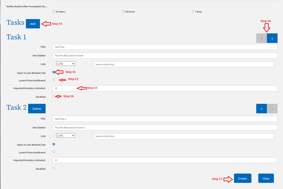
11. Select the Open in new Window/Tab check box if you want the link to open in a new web browser window or tab.
12. Select the Launch from dashboard check box if you want the link to open directly from the dashboard, without the student going to the modal view.
Note: If you do not select the Launch from dashboard check box, the student is taken to the advisor card modal view when the task link is clicked.
Note: If you do not select the Launch from dashboard check box, the student is taken to the advisor card modal view when the task link is clicked.
13. Enter the number of minutes you expect this task to take the student to complete in the Expected Duration (minutes) field. You can increase or decrease the time by clicking the increment/ decrement icon that appears at the end of the field.
14. Select the Disabled checkbox if you want to hide the task from the students’ Advisor Card portlet.
15. Click the green Add button next to the Tasks heading to add another task.
16. Click the green Up or Down arrow on the far right of a task to move the corresponding task forward or back one position.
17. Click the Create button to add the advisor card to the list of Existing Cards. Or, click Clear to delete all the field values you entered.
18. Click the green Up or Down arrow to the left of an advisor card to move the corresponding card forward or back one position.

19. Place the cursor over the white box with black arrows for an advisor card, then right click and hold down to grab the corresponding card. Drag the card up or down and release the mouse click to drop it in the desired card position.

20. Click the Edit button on the far right to edit the content of the adjacent card.
21. Click the Delete button on the far right to remove the adjacent card from the list.
The dashboard view of the Advisor Card portlet is displayed to students when they log into MyPath. Tenant Admins can view the student layout on their College tab.
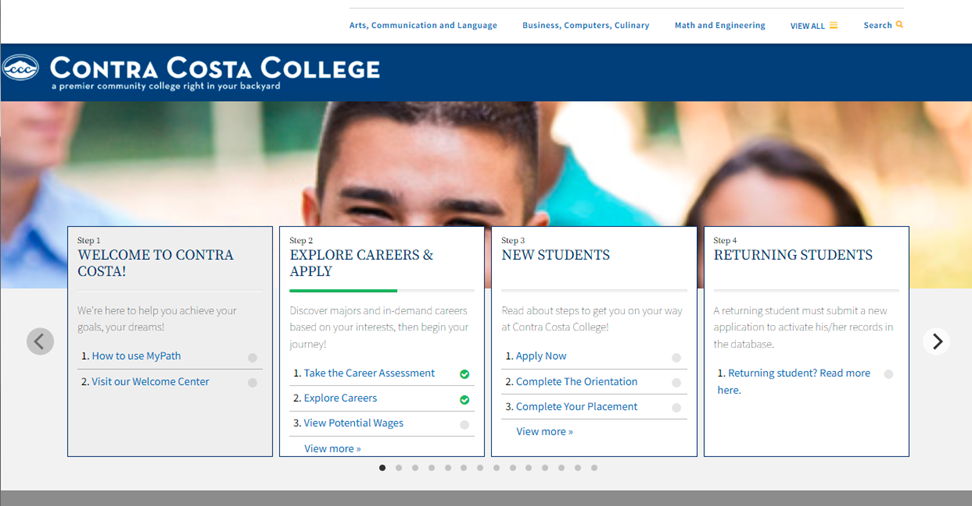
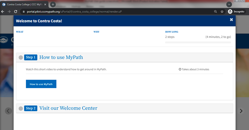
When a student clicks on either the advisor card title or a Link task on a card, they are taken to the focus view. The focus view opens the card in a modal. The advisor card’s title, What (reason for the card), Why (objective of the card), and duration are displayed.
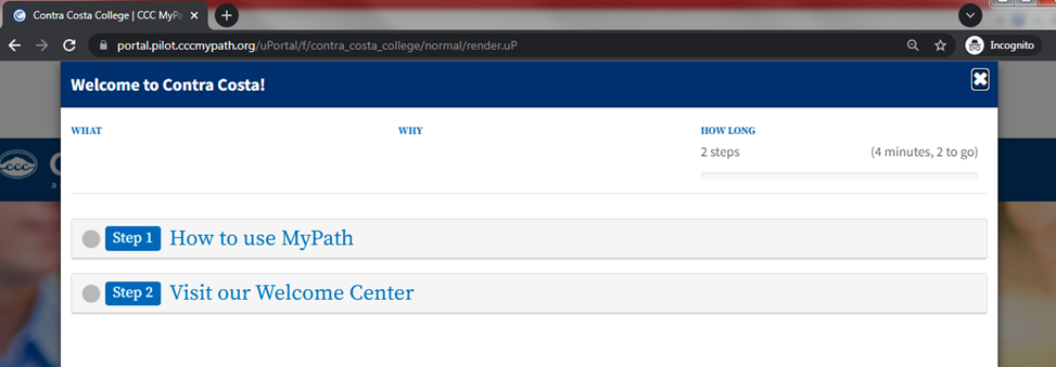
Clicking a task title expands the task pane, displaying the description, duration, and link.
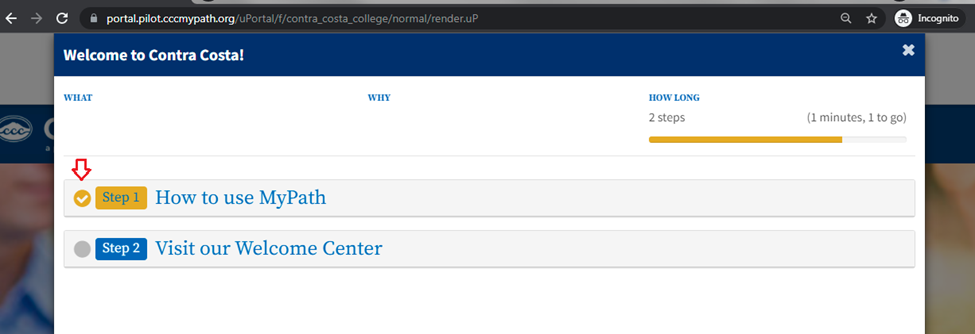
After a task link is clicked, a yellow check box is displayed, indicating the task is completed and the card’s status bar is updated.
Note: Tenant administers can choose to have an advisor card Link task open from the dashboard view. If the Launch from dashboard box is checked for a Link task, it will not take the student to the focus view when they click on the task title.
Note: Tenant administers can choose to have an advisor card Link task open from the dashboard view. If the Launch from dashboard box is checked for a Link task, it will not take the student to the focus view when they click on the task title.
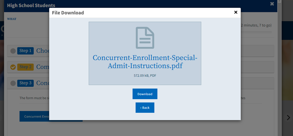
When a student clicks either a Download task or Upload task link while viewing the dashboard view of the Advisor Card portlet, a modal is opened.
Clicking the Download button will download the file to your computer, close the modal, mark the task as complete and update the card’s status bar.
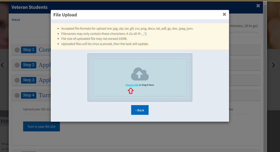
Students can upload a file to an advisor card task by either clicking the Choose a file link or drag and drop the file into the modal.
After a student uploads a file, they are informed it has been received and will be scanned for viruses. A yellow hourglass is displayed next to the task indicating in progress status.
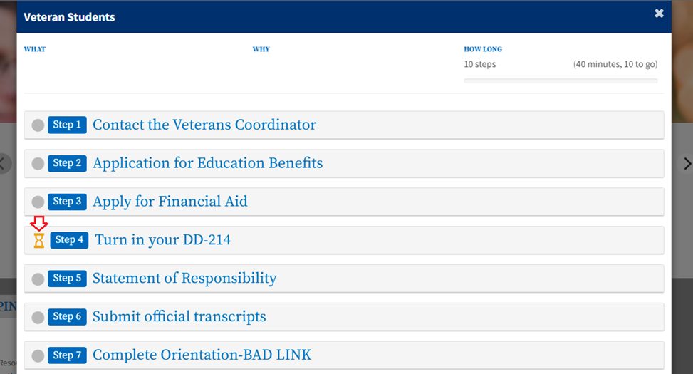
If the downloaded file fails the virus scan, MyPath will notify the student a virus was found and a red hourglass is displayed next to the task indicating file rejected status.
If the downloaded file passes the virus scan, MyPath will notify the student the file had been accepted, mark the task as complete and update the card’s status bar.
When a student uploads a file for an advisor card task and it has passed the virus scan, an email is sent notifying the college of a new document being delivered. The email contains a link to WorkDocs where the college can view and download the document. Admins can specify the email address where these notifications are sent to.
Use the following steps to add or edit the email message used to receive notifications about when a student has uploaded a document:
Enter email in Search field and select the Document Delivery Email option.
[ screen shot ]
2. In the New Email field, enter the email where the notifications will be sent to.
[ screen shot ]
3. Click the Submit button.
[ screen shot ]
Note: After submitting the change a confirmation message will be displayed and the new email address will appear to the right of Current Email.
Note: After submitting the change a confirmation message will be displayed and the new email address will appear to the right of Current Email.
In the College Portal, layout management refers to the setting up, editing, and display of the user interface. Layout elements include tabs, columns, and channels using the underlying framework of Distributed Layout Management, or DLM. DLM allows Portal administrators to configure layout management permissions to tenant administrators (College Admins).
A key concept in DLM is the "fragment." A fragment, in context of the Portal, is a layout element or piece that can be pushed out/merged into the larger end-user layout display. See Fragment Administration Vs. Personal Customization below for more information.
Layout management in your college portal involves configuring what content displays where and for which audience.
All the college portal content is provided in a "tab" structure that is itself a portlet. The content you provide to the end-users of your college portal will be added on a tab via portlets as well.
In essence, you will be placing portlets within portlets. The following sections will tell you how to use Fragment Administration to add and organize content on a tab.
College portal administrators customize the portal display using fragment administration. (Personal customization may become available at a later release of the MyPath Portal.)
A fragment, in context of the Portal, is a layout element or piece (i.e. portlet) that can be pushed out/ merged into the larger end-user layout display.
See the next section (Adding Content to a Tab) for more details.
Your college portal will have more than one tab available for displaying content to end users. Use the following steps to add content (portlets, app launchers, surveys, etc.) to your College tab that will appear to students.
1. From the Tenant Admin tab -> Fragment Administration panel, select a group to which you want to apply the fragment from the drop-down list and click Go to open the DLM fragment administration screen.
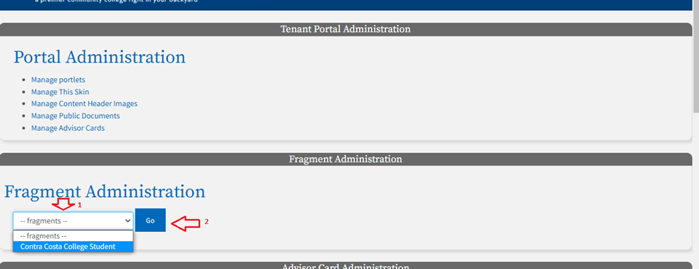
2. Click the Edit Content tab (on the DLM fragment administration screen) to open the Tab Configuration panel.
Note: Click the Pin icon to pin the Tab Configuration panel to the top of the browser window. This will make your next configuration steps easier.
Note: Click the Pin icon to pin the Tab Configuration panel to the top of the browser window. This will make your next configuration steps easier.
3. From the Tab Configuration panel, click a category to display the portlets within it. The category you selected when creating the portlet is what you should select here.
[ screen shot ]
4. Hover over the top left of the portlet within the category you selected to display the Favorites and Add links. The mouse pointer should change to a diamond-shaped icon as in the image above.
5. Click the portlet drag it down to the panel/area where you want it to be added. Once you have dragged the portlet to that area, release the mouse.
Note: You can also click the portlet’s Add link to make it appear in its own panel on the page.
Note: You can also click the portlet’s Add link to make it appear in its own panel on the page.
7. Click the Done Editing link to close the Tab Configuration panel and its Categories and return to the tab with the portlet you just added displays.
8. Scroll back to the top of the screen and click the Exit button to leave the Fragment Administration screen.
9. Click the college tab where you added the portlet to view the change.
The Navigation Menu, also know as the Nav Menu portlet, displays a list-style menu of links appearing in the header to all your college users. The Nav Menu is not enabled by default. Tenant Administrators can turn on the Nav Menu for their school and customize the content to fit their unique needs.
1. Navigate to Tenant Admin tab -> Portal Administration panel -> Manage portlets link to display the Portlet Registry screen.
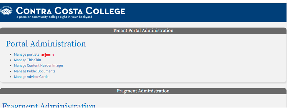
Note: The Nav Menu portlet for your specific college should appear within the Portlet Registery and be in CREATED state. Once you move the portlet into PUBLISHED state, it will appear in the header.
Note: The Nav Menu portlet for your specific college should appear within the Portlet Registery and be in CREATED state. Once you move the portlet into PUBLISHED state, it will appear in the header.
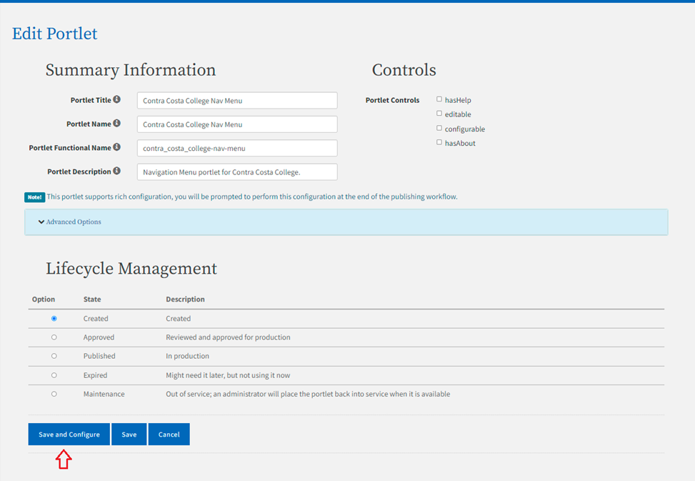
2. Click the Edit link for the Nav Menu portlet.
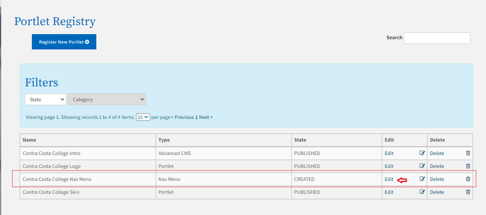
3. Scroll down to the Lifecycle Management field group and select the Published radio button.
4. Click the Save and Configure button.
Note: The Edit Portlet Configuration page is displayed. See Adding Top Level Links and Adding Dropdown Links for information on configuring your navigation menu link.
Note: The Edit Portlet Configuration page is displayed. See Adding Top Level Links and Adding Dropdown Links for information on configuring your navigation menu link.
If no menu items are added, the top-level menu can be configured as a link.
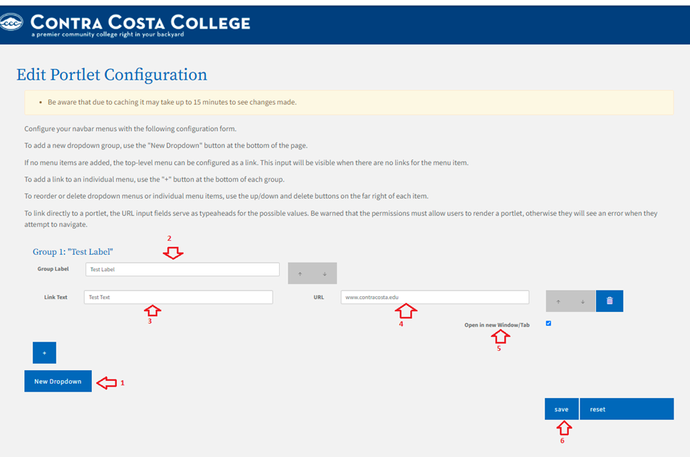
Click on the New Dropdown button to add a dropdown group.
Enter up to 32 characters in the Group Label field.
Note: As you type the Group Label, the text to the right of Group 1 with auto-populate with the same name.
Note: As you type the Group Label, the text to the right of Group 1 with auto-populate with the same name.
3. Enter up to 2000 characters in the URL field. The content must be a valid URL (http://site, https:// site) or link to an internal portlet.
Note: As values are entered into the URL field, search results matching the entered values will be displayed for selection.
Note: As values are entered into the URL field, search results matching the entered values will be displayed for selection.
4. Check the Open in new Window/Tab check box if you want the link to open in a new web browser window or tab.
Note: If you do not select the Open in new Window/Tab check box, the student will need to click their browser's back button to navigate back to the college portal after clicking the task link.
Note: If you do not select the Open in new Window/Tab check box, the student will need to click their browser's back button to navigate back to the college portal after clicking the task link.
5. Click the New Dropdown button again to add another group below the last group.
6. Click the green Up and Down buttons on the far right to select the order in which the groups are shown.
7. Check the red delete button (trash icon) on the far right to delete a group.
8. Click the save button to create the navigation menu link(s).
9. Click the reset button to cancel your changes and return to the menu’s original state.
Click on the New Dropdown button to add a dropdown group.
Enter up to 32 characters in the Group Label field.
Note: As you type the Group Label, the text to the right of Group 1 with auto-populate with the same name.
Note: As you type the Group Label, the text to the right of Group 1 with auto-populate with the same name.
3. Click the green "+" button below the group to add an individual menu link. This displays the Link Text and URL fields.
4. Enter up to 32 characters in the Link Text field.
5. Enter up to 2000 characters for the navigation menu's drop-down link URL in the URL field. This is the URL that the student will be directed to when they click the linked title entered in step 5, above.
Note: As values are entered into the URL field, search results matching the entered values will be displayed for selection.
Note: As values are entered into the URL field, search results matching the entered values will be displayed for selection.
6. Click the Open in new Window/Tab check box if you want the link to open in a new web browser window or tab. If you do not select the Open in new Window/Tab check box, the student will need to click their browser's back button to navigate back to the college portal after clicking the task link.
7. Click the green "+" button again to add another individual menu link below the last link.
8. Click the green Up and Down buttons on the far right menu items to select the order in which the links are shown.
9. Check the red delete button (trash icon) on the far right to delete a menu link.
10. Click the save button to create the navigation menu link(s). 11. Click the reset button to cancel your changes and return to the menu’s original state.
To generate a sense of brand for the schools, the Navigation Menu bar color will now be displayed in a shade matching the color for the Tenant Badge Header Background color. Tenant Administrators have the ability to adjust the Nav Menu bar color. Use the following steps to configure your Tenant Nav Menu Color.
Navigate to Tenant Admin tab -> Tenant Portal Administration panel -> Manage This Skin link to open the College Skin configuration screen.
Click the Tenant Nav Menu Color field label text, or its associated color box, to open the colors palette.
Click and drag the white-triangle slider to display color shades in the larger square box to the left of the slider.
Once the shade displays that you prefer, click in the square color box to select the color. The exact color selected appears in the Tenant Badge Header Background Color field with the color's hex code in white text.
Click Save to save your changes. Your college portal display now appears with the colors you selected for the background or text.
Note: Due to caching, it make take up to 15 minutes for changes to navigation menu color to be seen by students.
Note: Due to caching, it make take up to 15 minutes for changes to navigation menu color to be seen by students.
Links on Advisor Cards, App Launcher, Navigation Menu, and Content Portlets can be configured to pick up information about the user. Customized URLs going through the proxy can send the college's MIS Code as a parameter to an application. This can be done by appending the following code to the end of a URL:
[ screen shot ]
See the California Virtual Campus example below for more information:
[ screen shot ]
Static URLs have been created to redirect users from the MyPath application to other CCC applications. These URLs can be used by all colleges as links in Advisor Cards, App Launcher, Navigation Menu, and Content Portlets.
OpenCCC Apply: /uPortal/api/redirectToOpenCccApply
California College Promise Grant: /uPortal/api/redirectToOpenCccApply?altLocation=bog For authenticated users, the proxy will sign them into the new application and remember the MIS code of the college the student came from. Once on the new application, a return link is provided to take the user back to the MyPath application.
See the Advisor Card link example below for more information:
[ screen shot ]
Phone: 877-247-4836
Email: support@openccc.net
Enabling Services: crms@ccctechcenter.org
Online Support Site: CCCTechnology.info
Email: staffsupportccctc@openccc.zendesk.com